Serif fonts remain a foundation of typographic design, especially for books, branding, and editorial work. Their traditional roots, readability in long texts, and the elegance they bring to titles and headings make them indispensable. The TypeType serif fonts collection underscores how modern serif designs are blending history with innovation, offering options that work beautifully in print, digital, and brand identity.
What Defines Typeface Needs for Books, Branding & Editorials
Before digging into specific fonts, it’s useful to understand what qualities are most important in these contexts:
- Legibility and comfort for extended reading (books, magazines, long editorial articles).
- Distinctiveness and personality for branding, titles, covers—fonts that reflect tone and identity.
- Versatility in styles / weights so the same font family can handle body text, headings, subheads, captions.
- Strong technical support: large sets of glyphs, OpenType features, kerning, hinting. TypeType’s serif catalog delivers many of these.
See also: Leveraging Technology to Connect with Target Audiences
Noteworthy Serif Fonts in TypeType’s Catalogue
Here are some serif fonts from TypeType that are especially well-suited for books, branding, and editorial design, with notes on what makes each stand out.
- TT Norms® Pro Serif
A text serif designed to pair with the popular TT Norms® Pro sans serif. It’s ideal for long texts, books, and editorial pieces. It includes many styles—TypeType notes 24 styles in one of the functional serif listings with 1,236 characters per style. - TT Livret Text
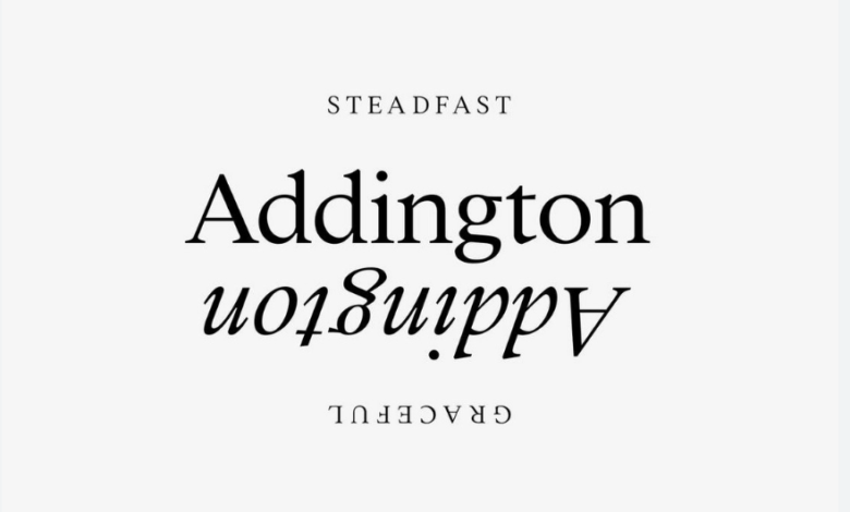
Elegant and modern, with strong use in fashion-oriented branding and premium editorial layouts. Its “Text” subfamily is built for readability in body text, while the display variants shine in headers. It supports a large glyph set. - TT Tricks
A modern text serif inspired by transitional serif styles. With squared ovals and more pronounced serifs, it brings personality without sacrificing utility. Good for editorial spreads where you want something slightly more expressive. Supports over 70 languages. - TT Marxiana Antiqua
A more historical/nostalgic serif face. Inspired by printing from the late 19th / early 20th century (for example, printing fonts used by magazines from 1887). Excellent when the design aims to evoke heritage, tradition, or vintage aesthetics.
- TT Rationalist
A slab serif with functional neutrality. Although slab serifs can feel heavy, Rationalist manages to stay clean and usable, making it great for headings, book title pages, or for branding that wants a strong serif presence without too much ornament. - TT Ricordi Collection
The Ricordi set comprises multiple display serifs (TT Ricordi Nobili, Greto, Marmo, Allegria, Fulmini, Todi). These are expressive, designed more for headings, art-direction in editorial work, or striking brand marks. For posters, cover titles, big typographic statements.
How to Use These Fonts Effectively
To get the most from serif fonts in books, branding, and editorials, here are best practices:
- Mood alignment: Heritage/vintage styled fonts (Marxiana Antiqua, Ricordi) work well with brands or editorial themes that value history, craftsmanship, tradition. More neutral or modern transitional or slab serifs fit minimal, luxe, or contemporary brands.
- Technical checks: Always check glyph coverage (does it include all characters you’ll need?), how italic versions are designed, if there are ligatures, stylistic alternates, and how well the font handles kerning/hinting, especially if some text will be digital. TypeType’s serifs typically offer strong support in these areas.
Conclusion
Serif fonts are far from outdated—they bring depth, heritage, readability, and elegance essential for books, brand identity, and editorial designs. From TypeType’s collection, faces like TT Norms® Pro Serif, TT Livret Text, TT Tricks, TT Marxiana Antiqua, TT Rationalist, and the Ricordi display set offer a range from subtle, workhorse text styles to bold, expressive headings. When wisely chosen and carefully paired, these serifs lift the quality of printed and digital publication work, reinforcing tone, credibility, and visual character.